Weekly Motion Graphics
Ongoing Series
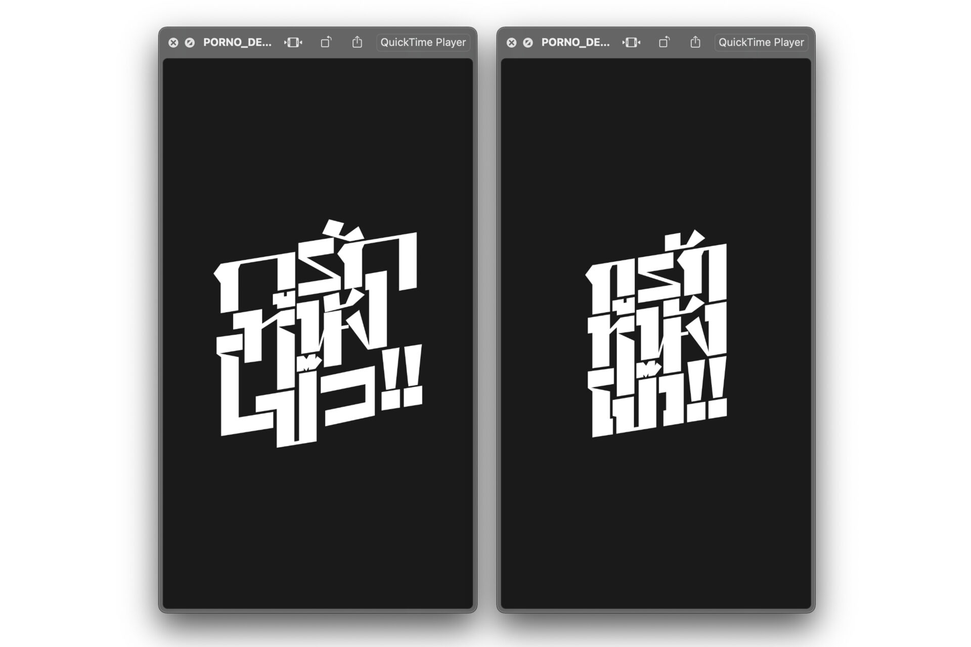
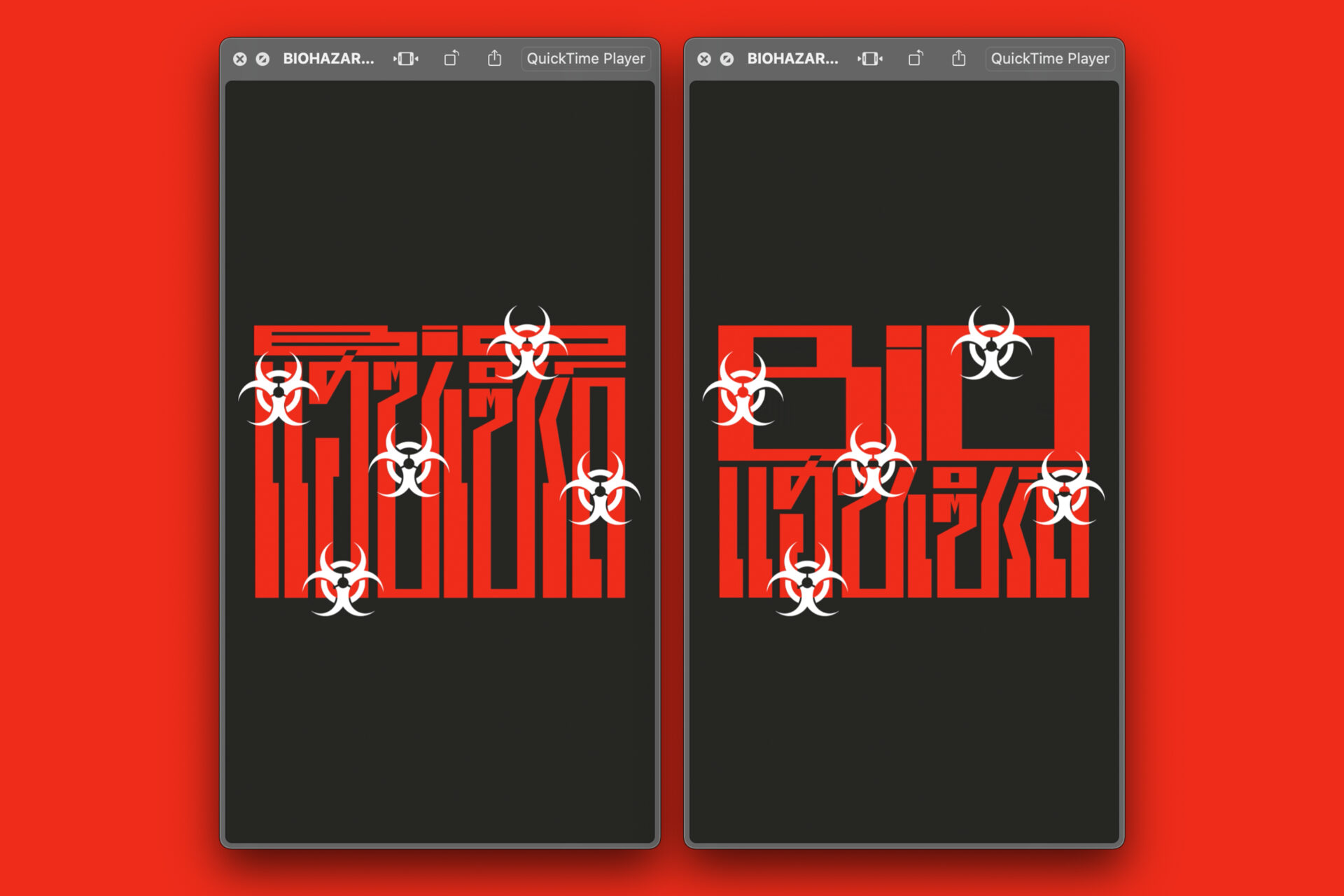
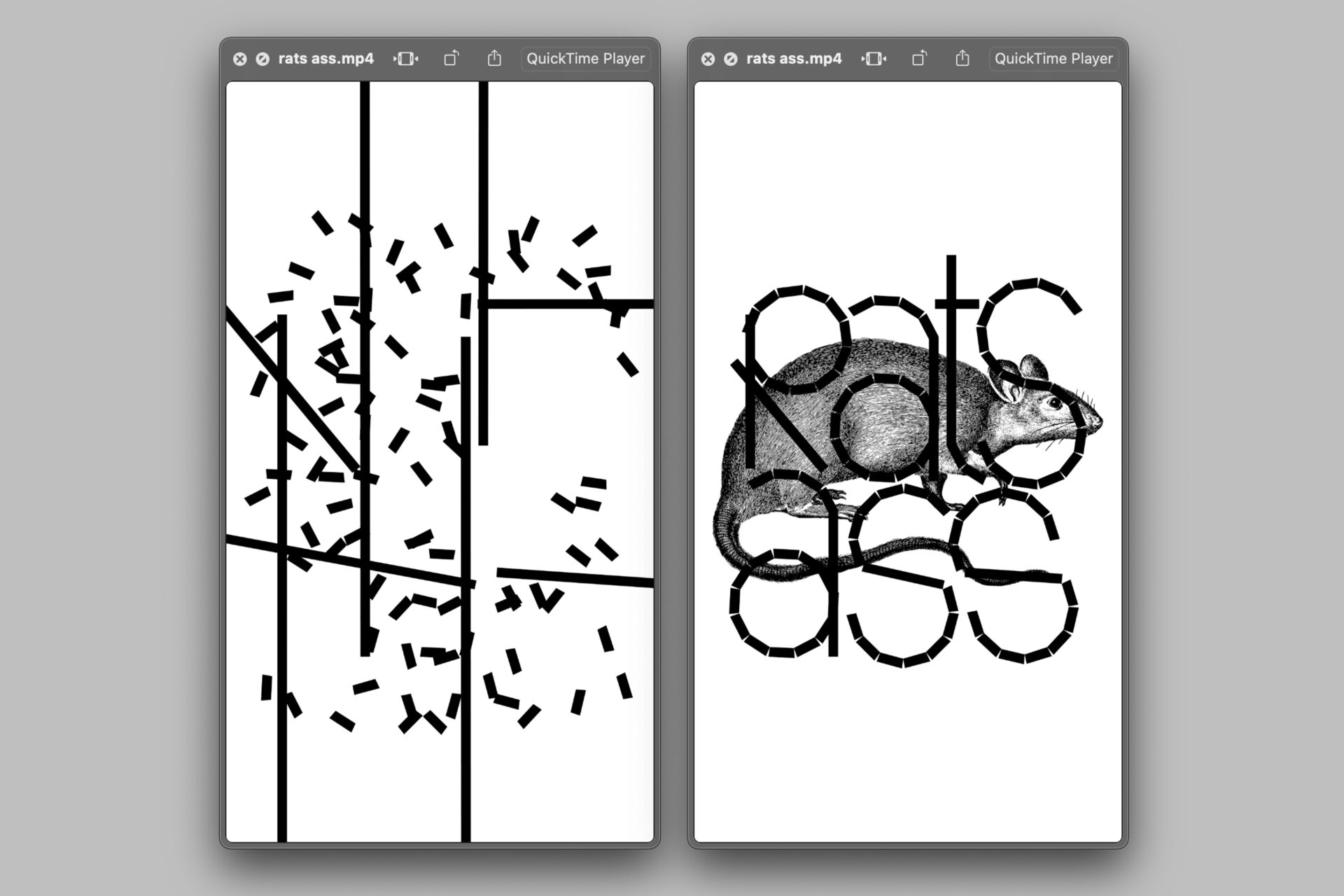
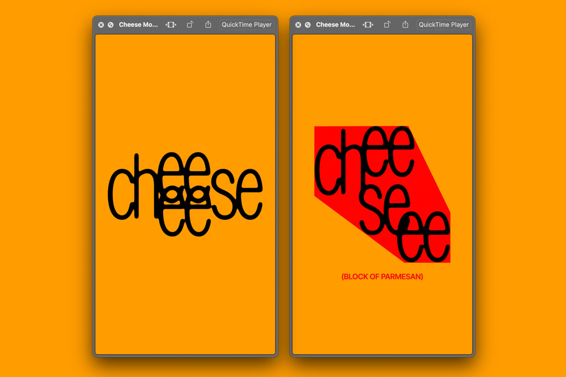
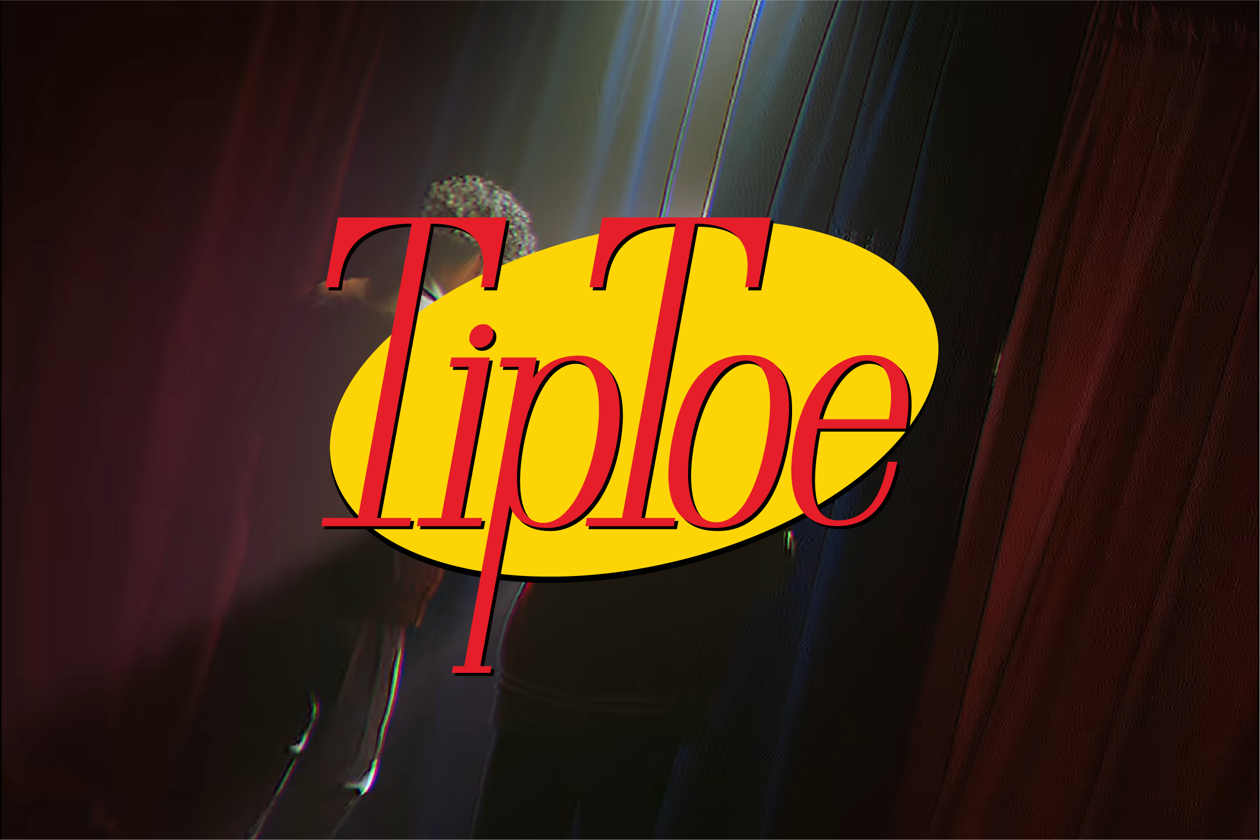
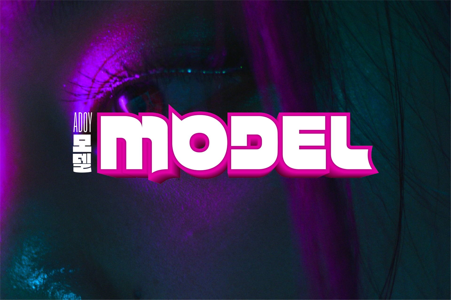
For the past few months, I've been subjecting myself to one Motion Graphic piece per week. Most of these are Type related as I try to experiment with Type Design in the realms of motion and making Typography move in ways that are interesting and new.
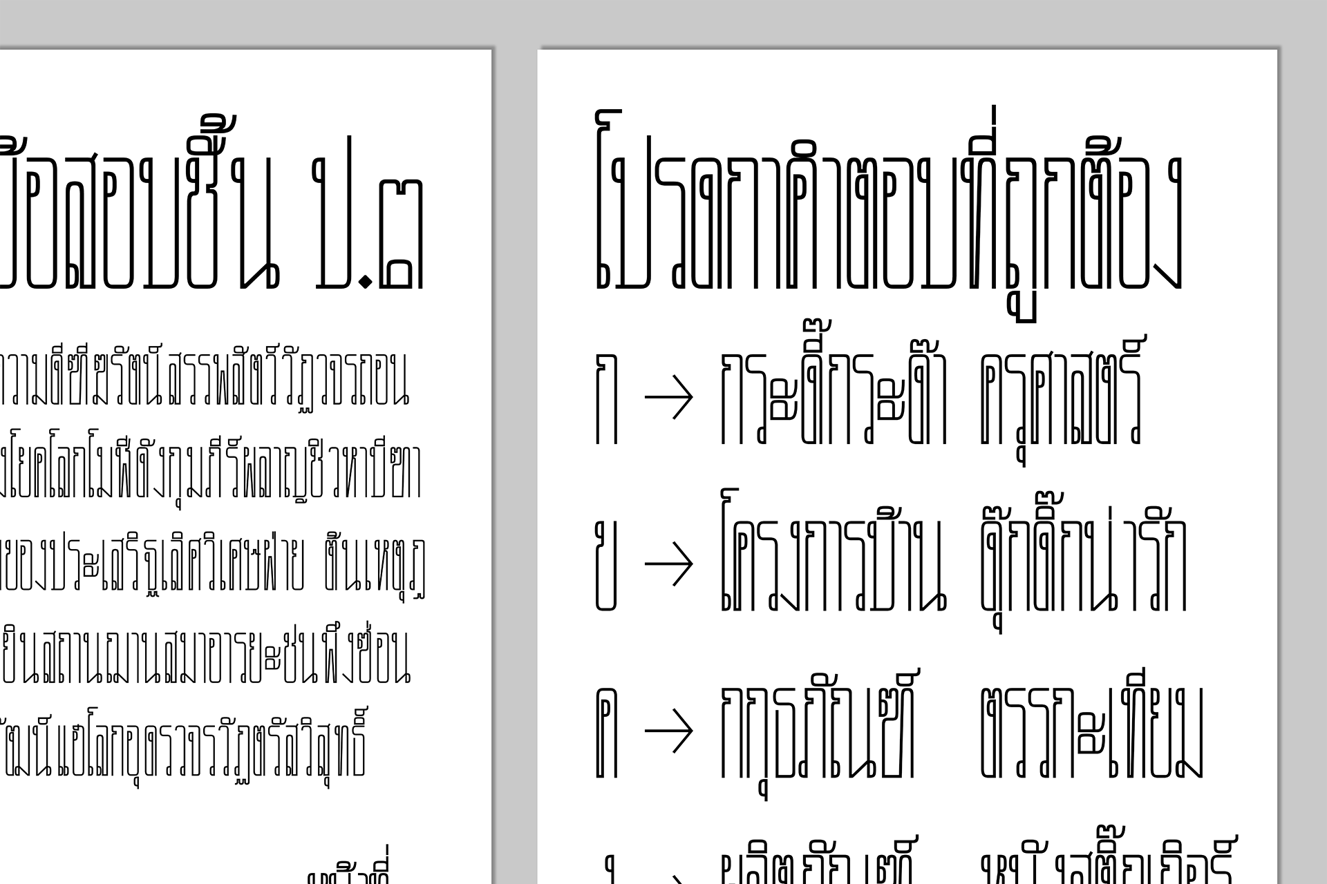
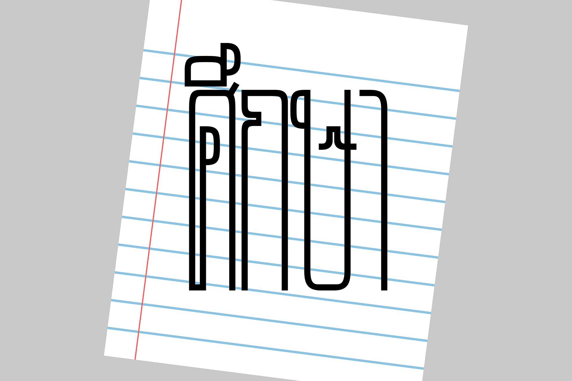
Suksa
Display Typeface Design
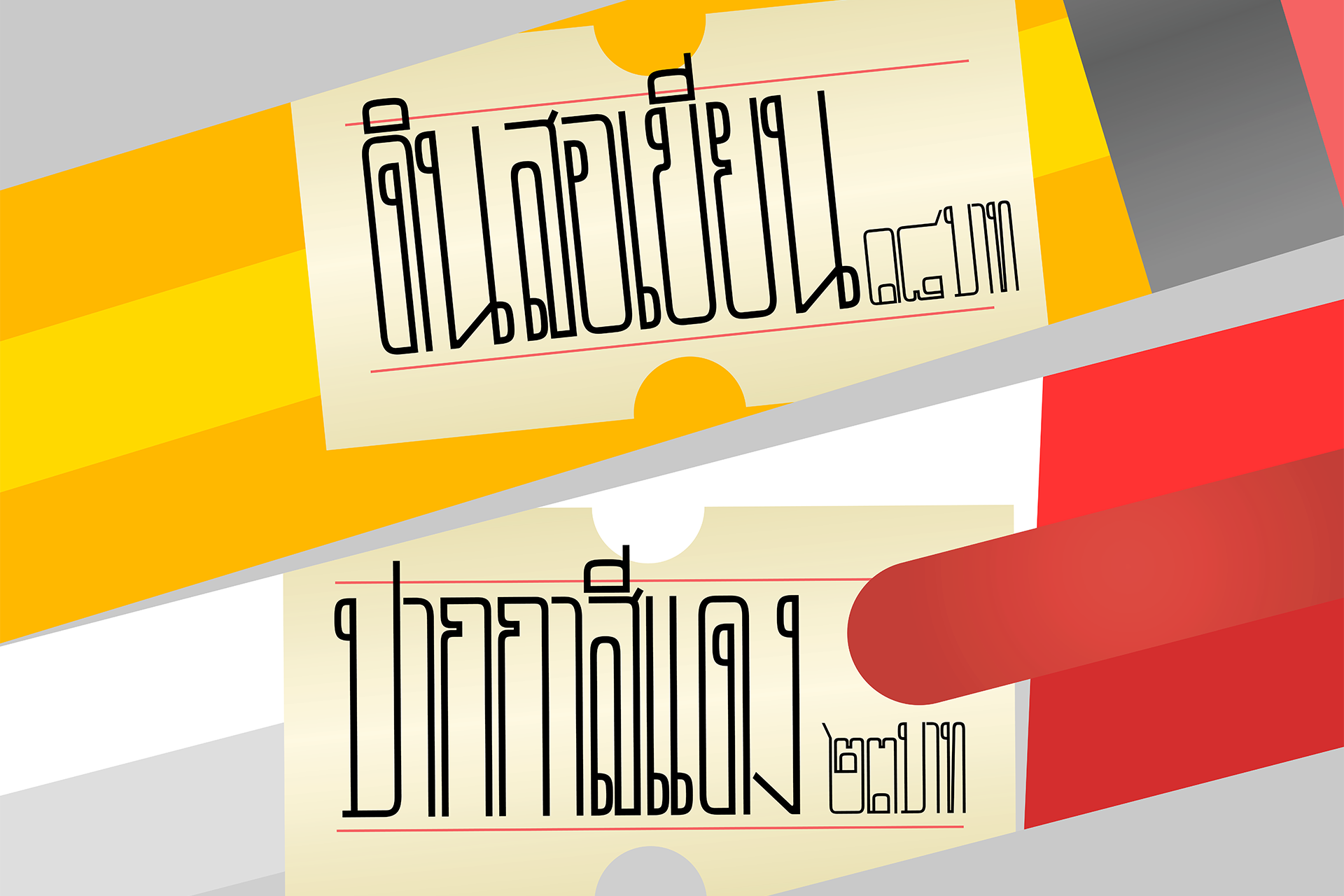
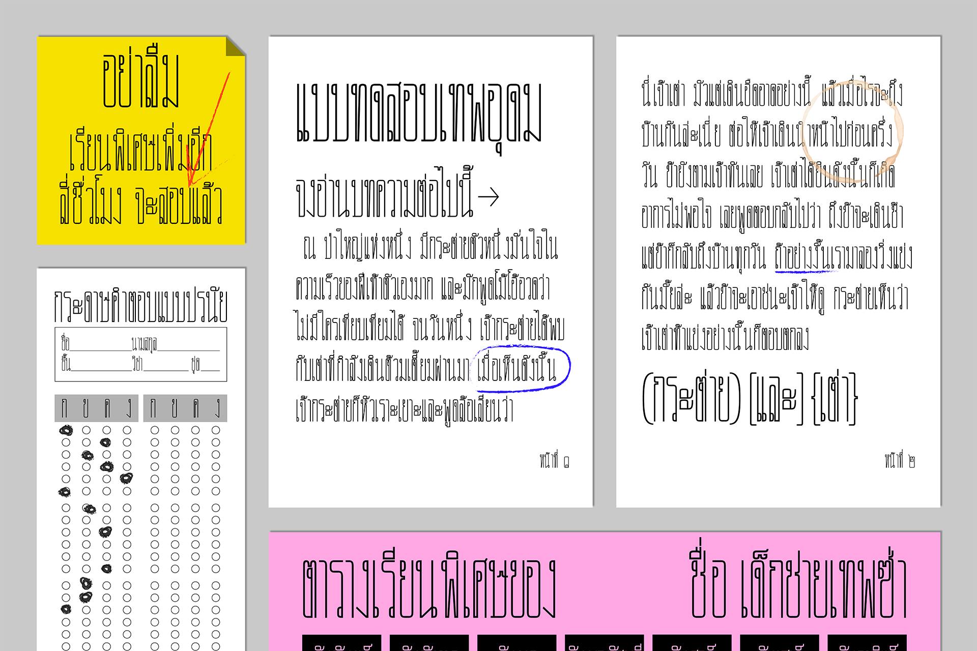
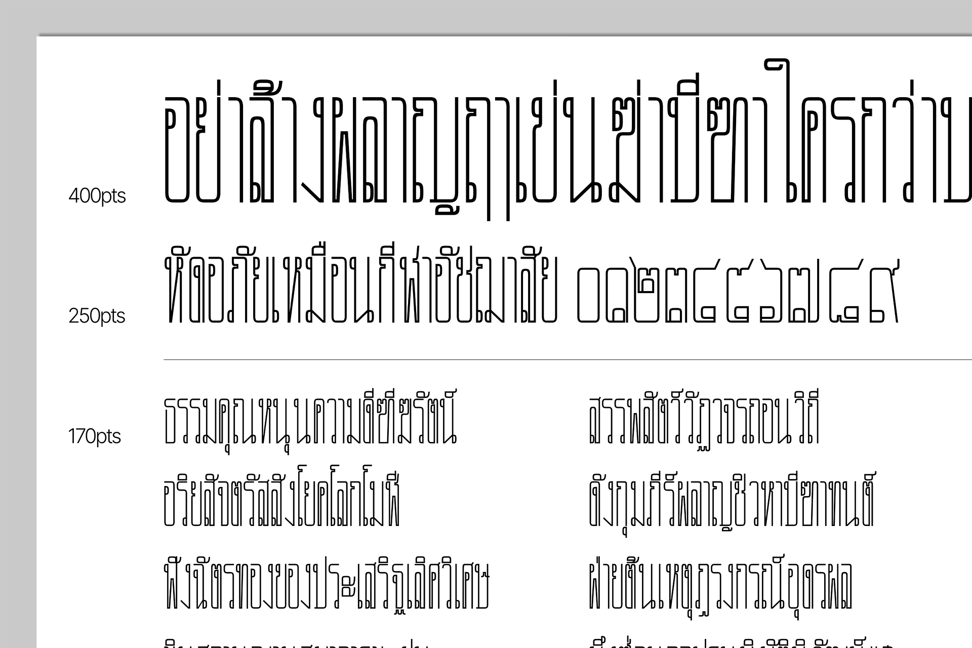
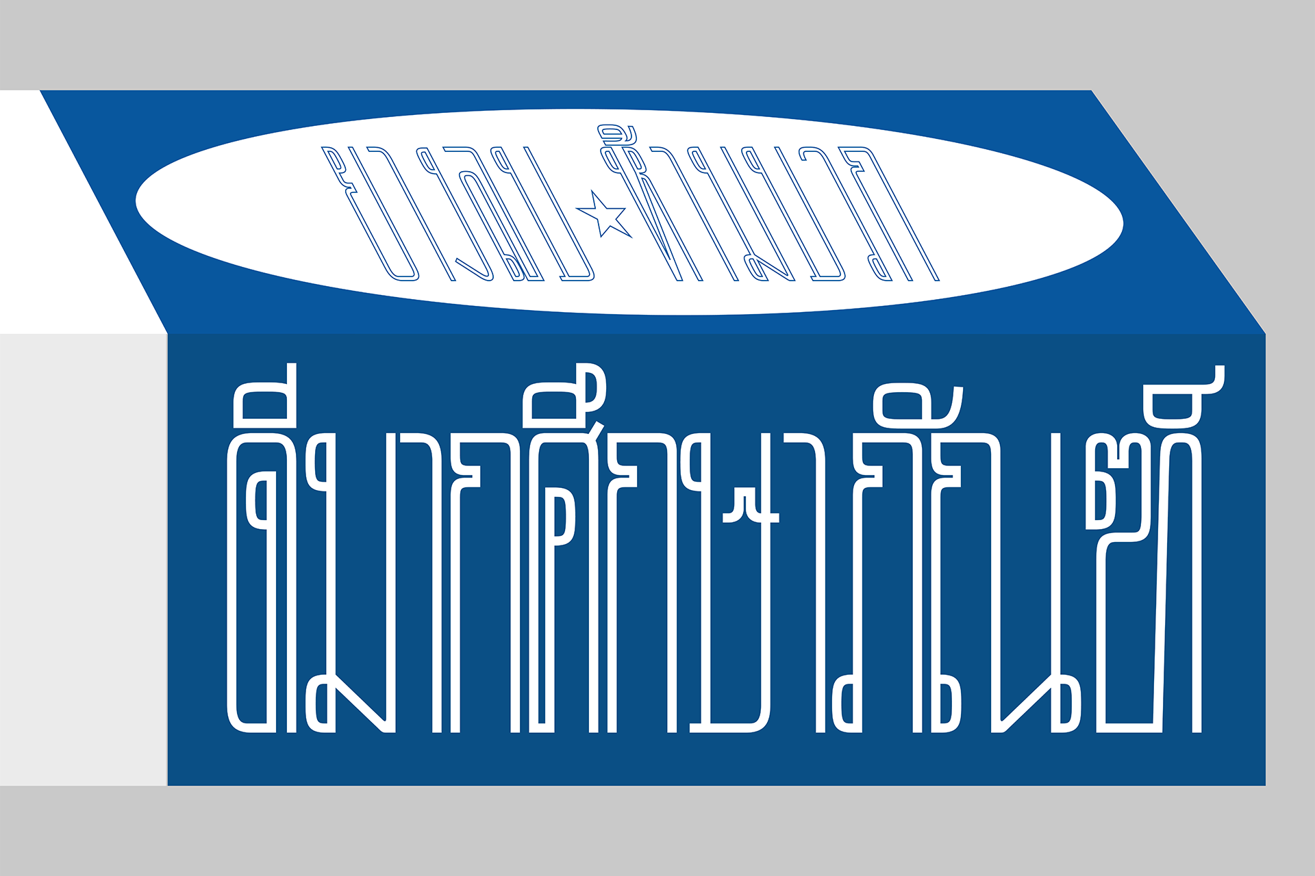
Suksa is a Thai-Looped typeface designed for display but works as texture at smaller sizes (like barcodes almost!). The forms are inspired by the ‘feeling’ of rigidness in the Thai educational system where students are forced to exceed standards through countless hours of cram school. This is apparent through Suksa’s traditional appearance and shape however, on a closer look, Suksa fails to follow many fundamental drawing rules. Almost as if Suksa is an allegory of a typical student struggling to keep up with academic expectations.
Various Type Projects
Lettering Design & Type Design
More info soon.
Yellow Hat
Online Recruitment Company Branding
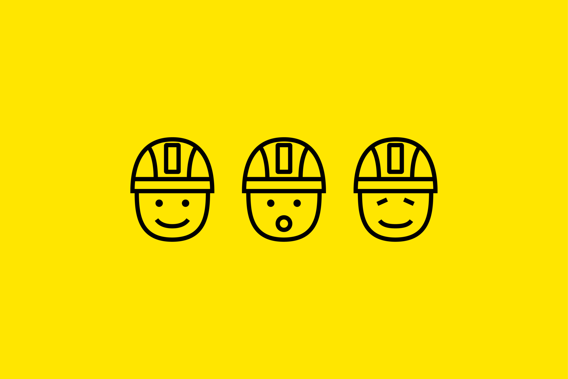
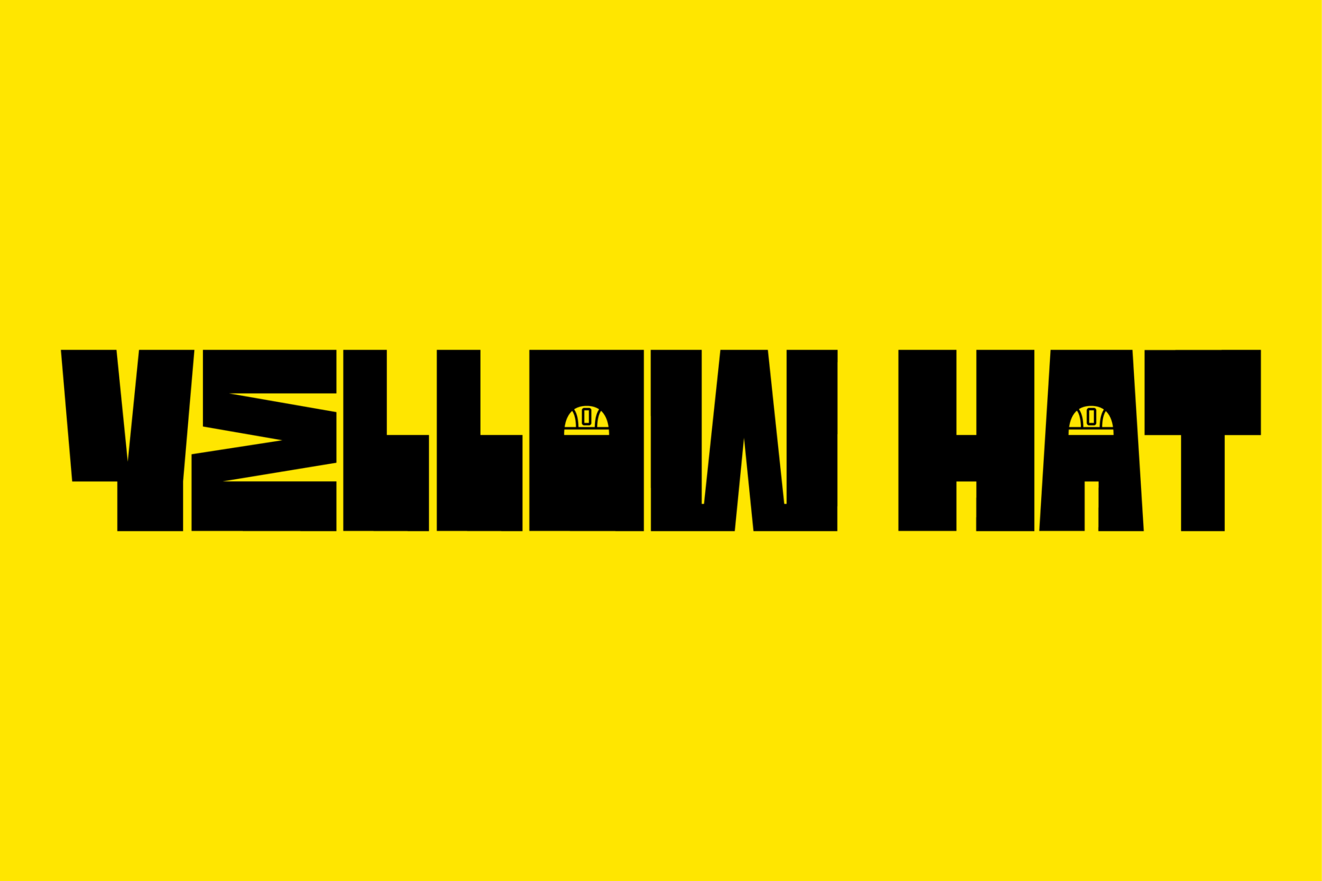
Yellow Hat is a fictitious hiring and recruitment company specializing in small scale construction and construction related jobs. As many construction jobs are one-time only projects, it has become a norm to recruit specific hires. The approach to this project is very unique as it utilizes a humanistic approach. Another factor that I wanted keep in mind was that all assets had to be done by me making it fully mine.
Oddeity Hotel
Boutique Hotel Branding
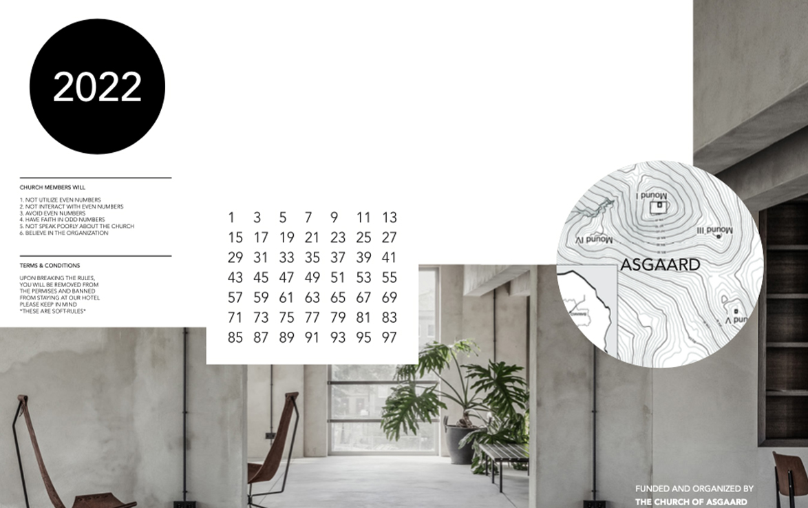
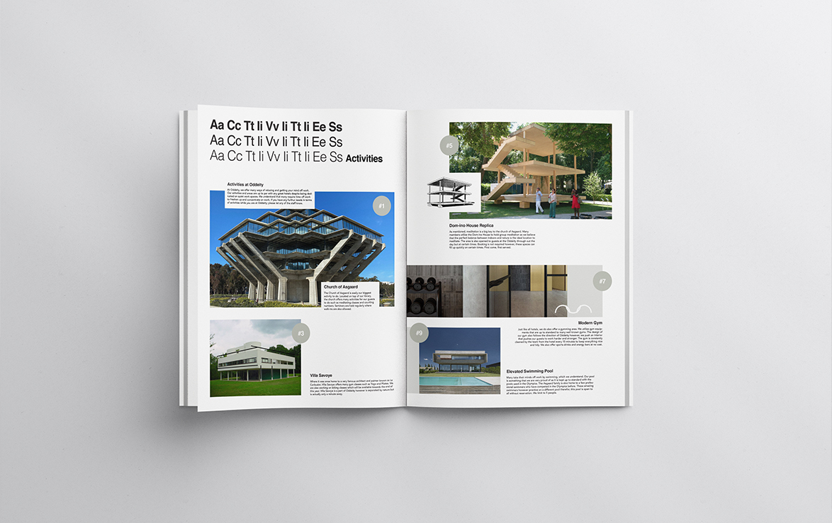
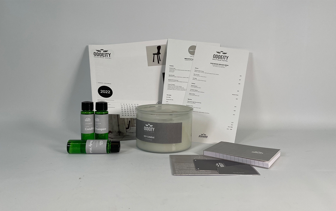
High-end graphic design requires a lot of work and finesse as a thin grey line, exists between high-end and corny. After years of self-study, this was something I realized during my Print and Production class. For our final project, we were tasked with creating a look-book and products for a boutique hotel. As our professor was extremely specific on conceptualization, our concepts had to be as tight as it could be.
WIPS Office Supplies
Corporate Identity & Branding
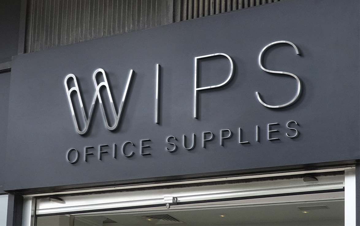
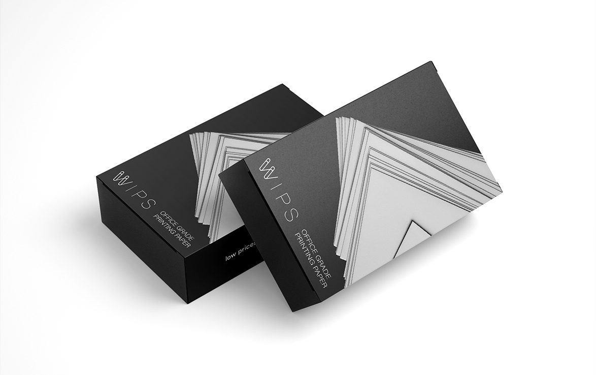
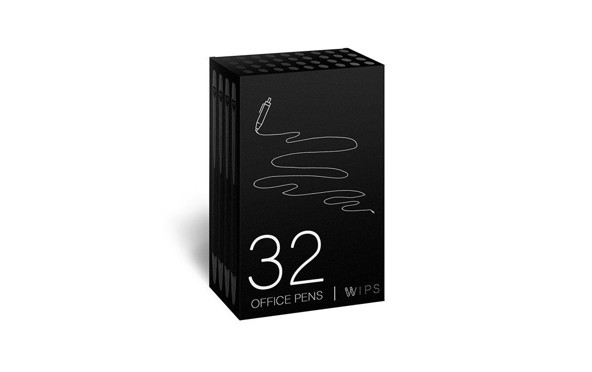
During summer break, I challenged myself to several design briefs generated online. For the first one, I was task with a full branding and identity package for a chain office supplies company. The finished package had to be authentic, luxerious yet affordable.
esoteric Lines
Event Systems & Branding
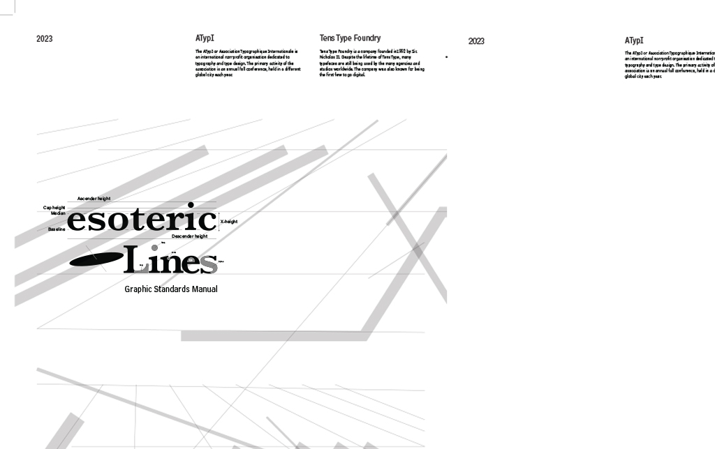
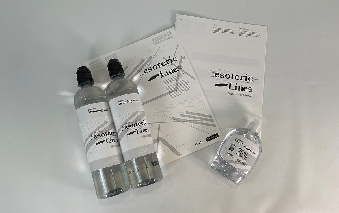
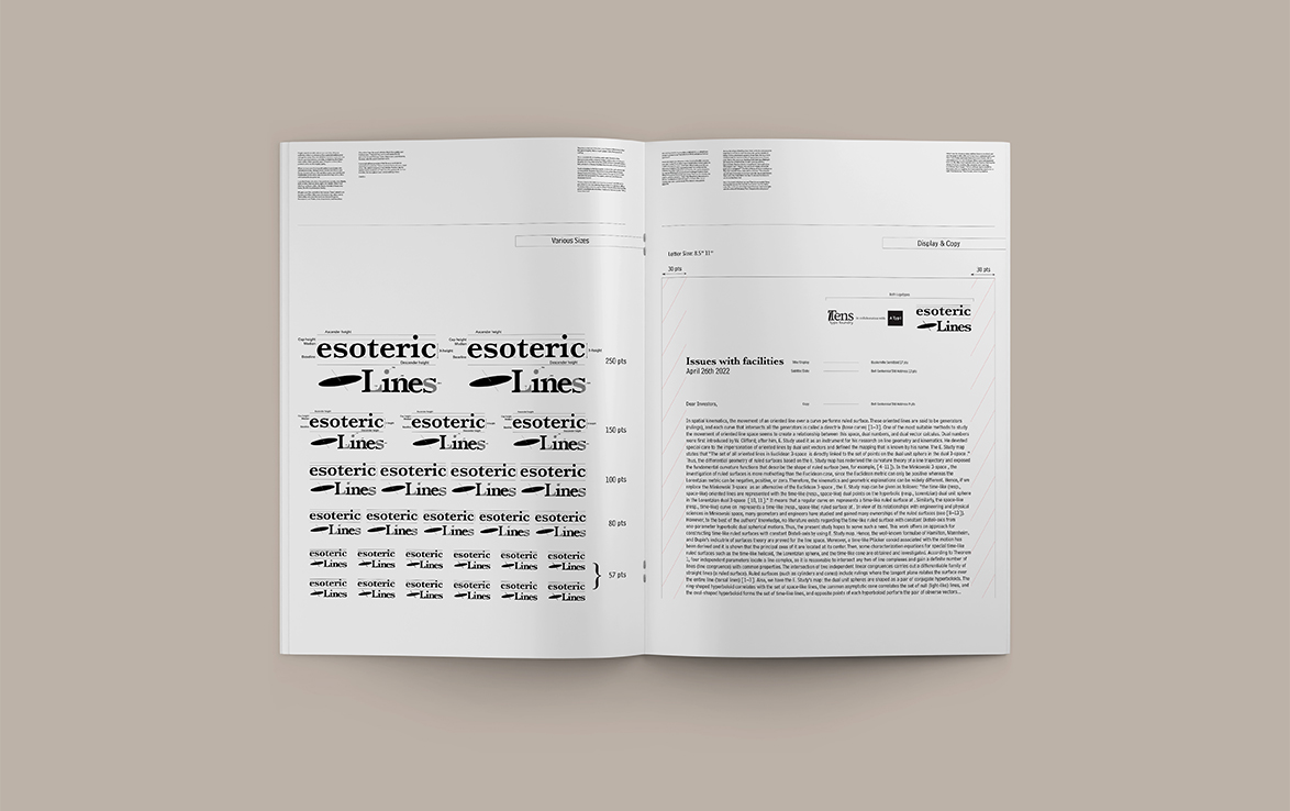
For our Typography 2 class, we had to come out with marketing materials for our own Type conference which would be held in Paris. One of my deliverables include a Graphic Standards Manual; a manual which makes visual coherence through out.
A Taxonomy of Office Chairs
Book Signing Event
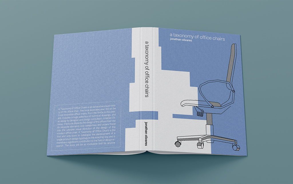
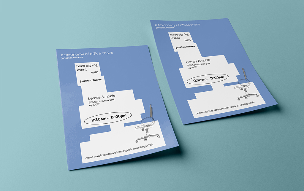
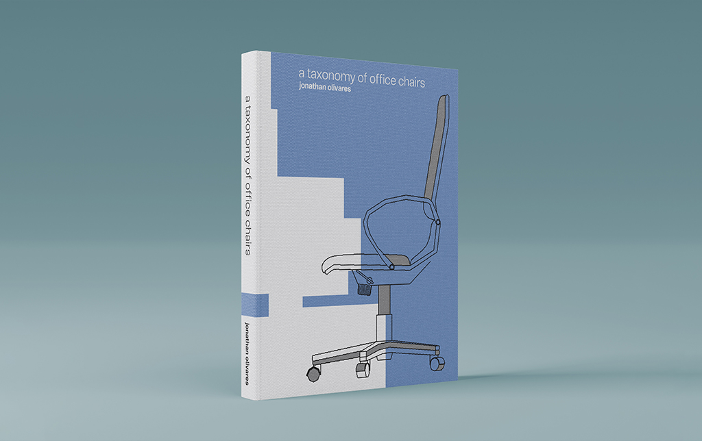
For my very first project for my very first Graphic Design class at SCAD, I was tasked with creating a book cover for. I decided to go with a very unique book by Jonathan Olivares on the taxonomy of office chairs. Roughly 3 years later for my Portfolio class, I finally made the project feel complete by creating a book signing event around the book itself.
typografie:bkk
Poster Series
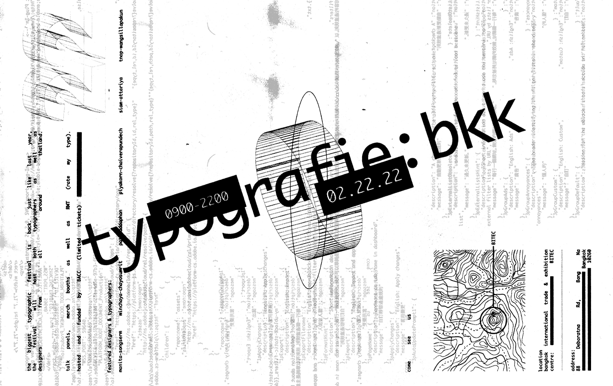
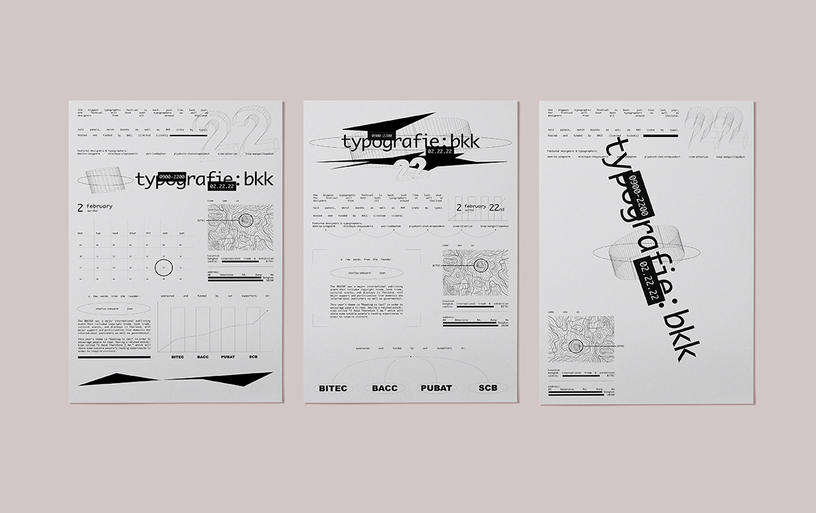
typografie:bkk is a fictional typography convention created for a project in Typography 2. The original poster was printed on letter-sized paper which was then left exposed to dirt and scratches. After the distressing process, it was scanned with a broken scanner in order to further enhance its unique flaws.
Hanatrash Poster
Poster Series
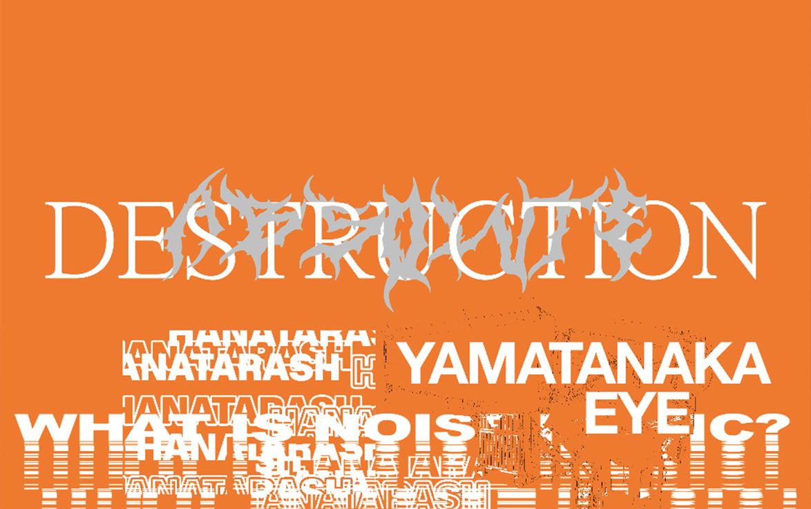
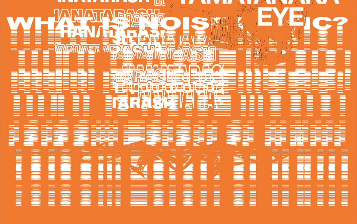
High-end graphic design requires a lot of work and finesse as a thin grey line, exists between high-end and corny. After years of self-study, this was something I realized during my Print and Production class. For our final project, we were tasked with creating a look-book and products for a boutique hotel. As our professor was extremely specific on conceptualization, our concepts had to be as tight as it could be.
Raf Simons F/W 18
Runway Editorial
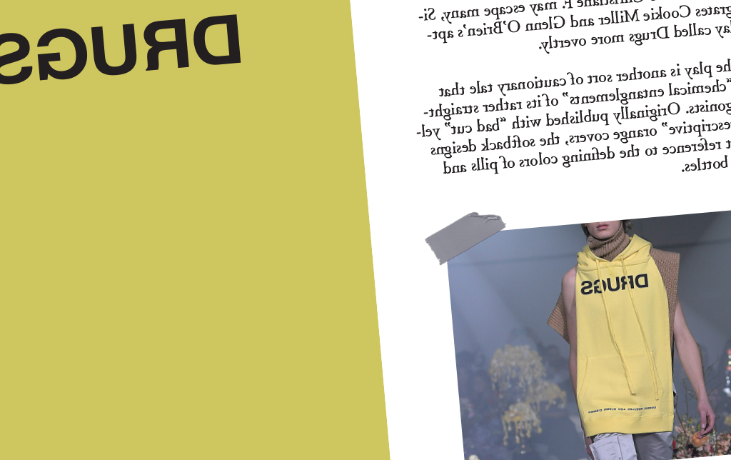
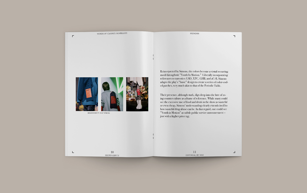
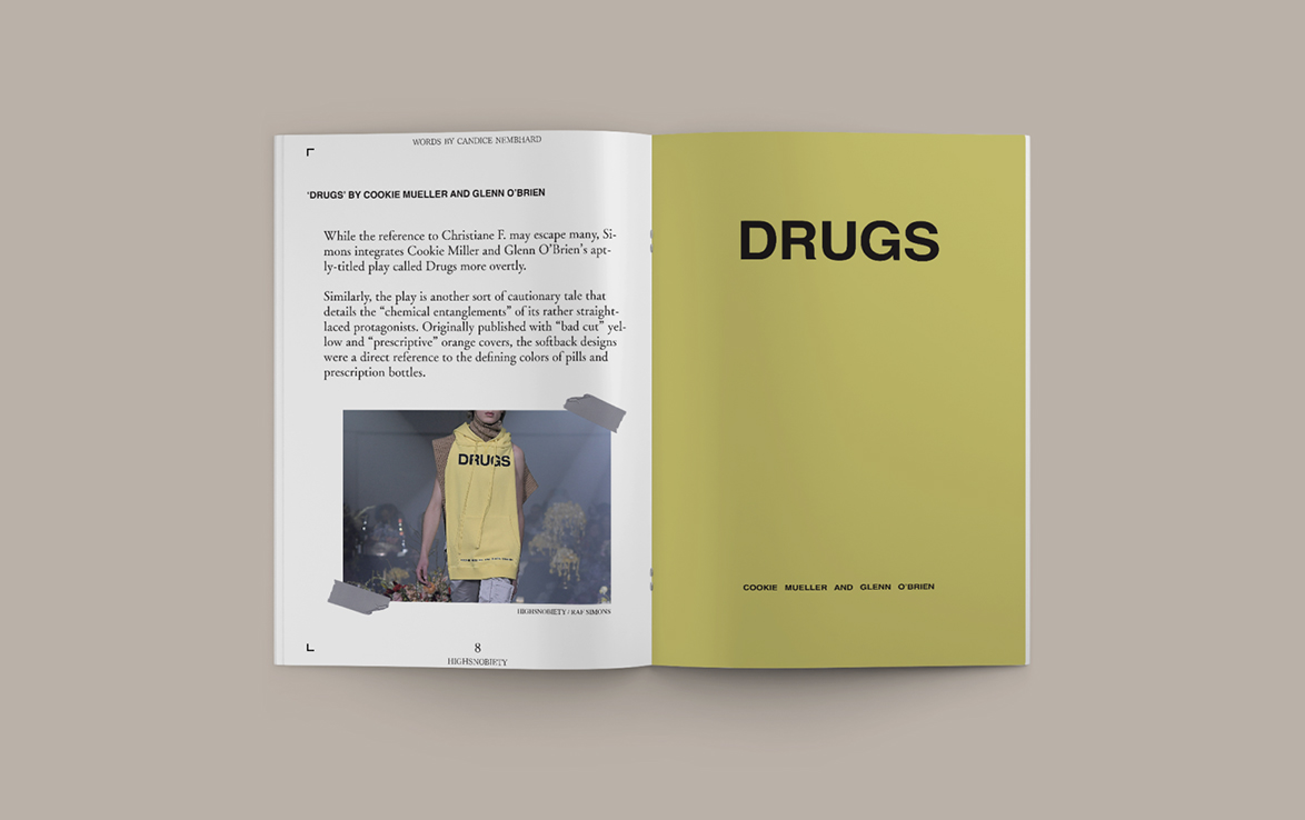
For a short project in our production in advertising class, we were tasked with a short booklet. The requirements were to include actual text as well as editorial pictures, and there were no limitations on theme. I decided to go with the topic of Raf Simons' Fall/Winter 18 collection.
Converse Campaign
Advertising Campaign
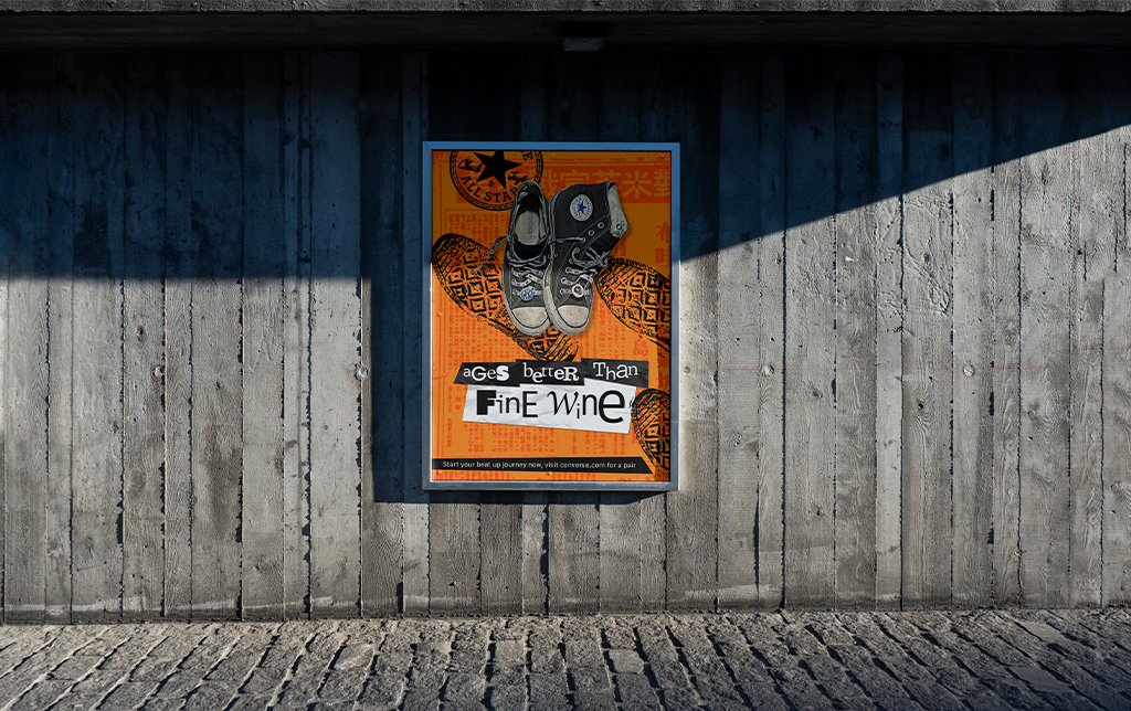
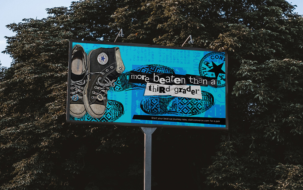
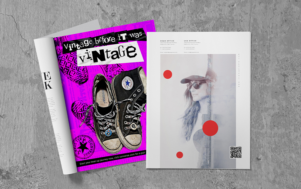
For our portfolio class, we were tasked with revising an old campaign. During one of my first classes in advertising, I did a campaign for Converse. The original campaign was very simple and plain so I've decided to redo the entire direction. This vision was a mix of grunge as well as bright colors. The concept itself revolves around how Converse sneakers look amazing despite how worn and how beat up then can get.
NON-BOOK
Booklet & Editorial Design
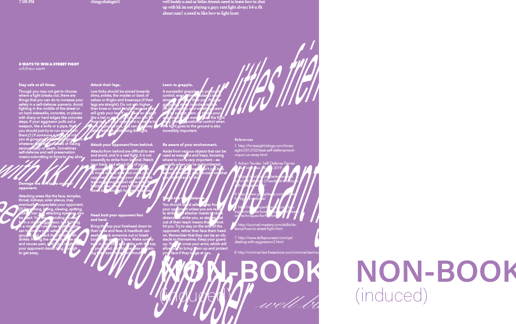
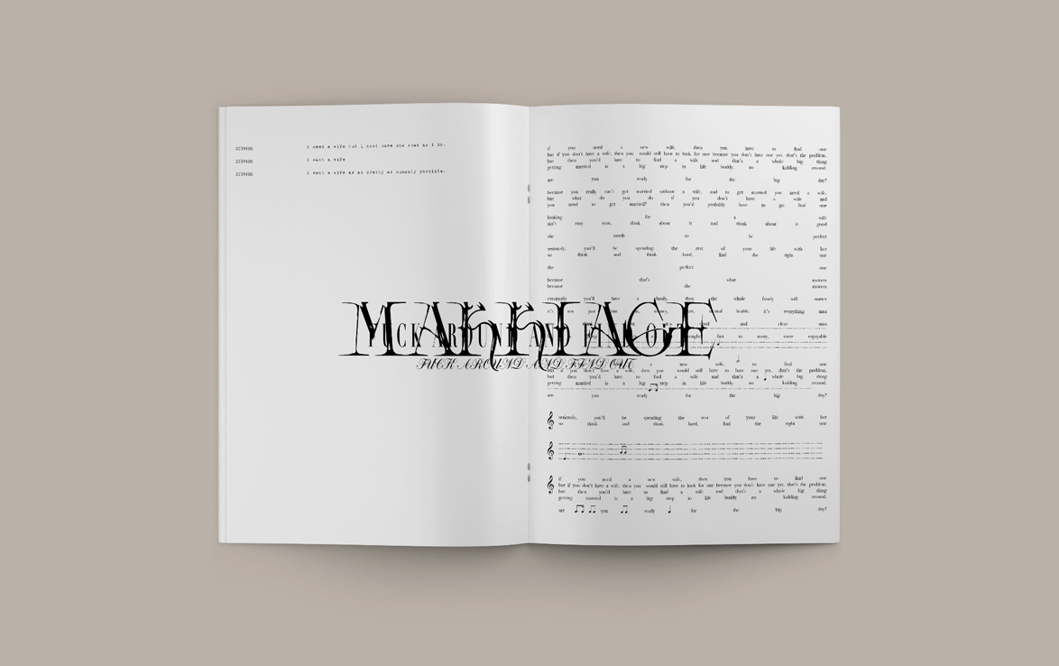
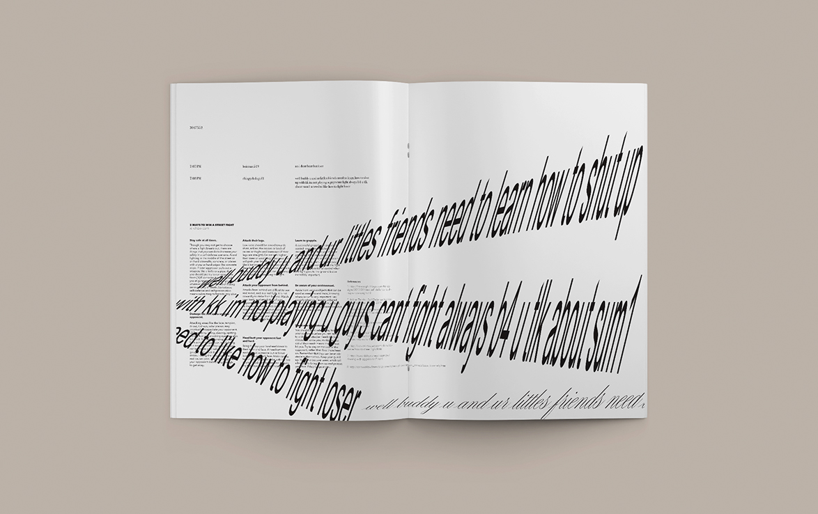
For our final project for Typography 2, we had to create a booklet that was at least 20 pages. The context of this booklet can not have anything other than typography. As I started realized how repetitive the book became, I knew I had to mix things up. The booklet eventually became: NON-BOOK (induced).
KIDULT Booklet
Booklet & Editorial Design
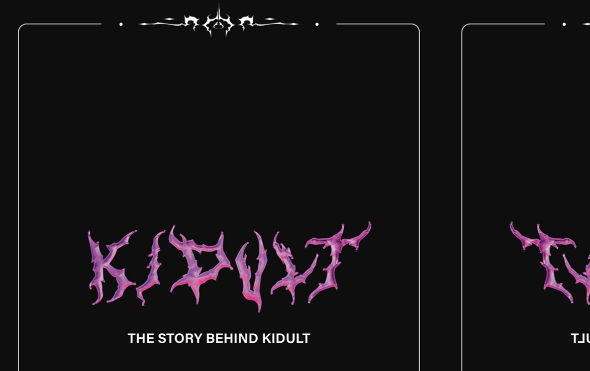
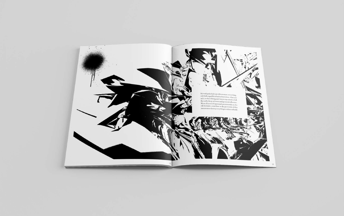
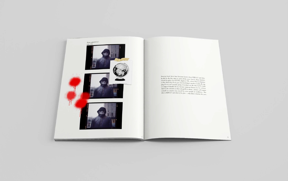
The world of graffiti art is extremely interesting. Commonly associated with anarchy and vast political views, graffiti artists that stand out are extremely talented and elaborate; one of them being KIDULT. A French graffiti artist who acts as an activist of the fashion. Being interested in both, graffiti and fashion; I chose KIDULT as my final project for my Media Management class.
GG Allin Poster
Poster Design
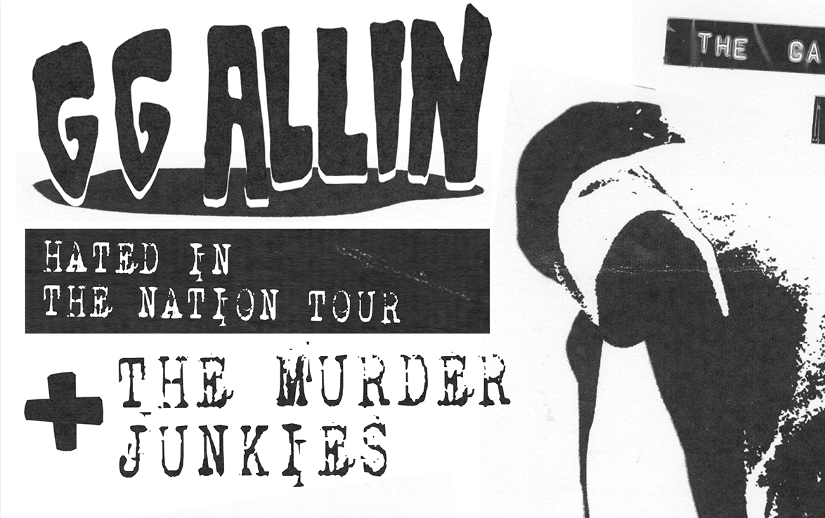
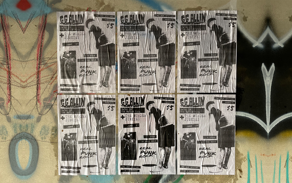
For the final project to our Intro class, we were given the task of recreating a poster from a previous era. Without much thought, I knew that creating a poster from the punk era would be interesting. This is for its raw and unfinished look. Weirdly enough, this aesthetic is being used in many editorials despite its raw and unfinished state.
