Yellow Hat
Duration: Three-day Sprint
Yellow Hat is a fictitious hiring and recruitment company specializing in small scale construction and construction related jobs. As many construction jobs are one-time only projects, it has become a norm to recruit specific hires. The approach to this project is very unique as it utilizes a humanistic approach. Another factor that I wanted keep in mind was that all assets had to be done by me making it fully mine.
Lettering Design
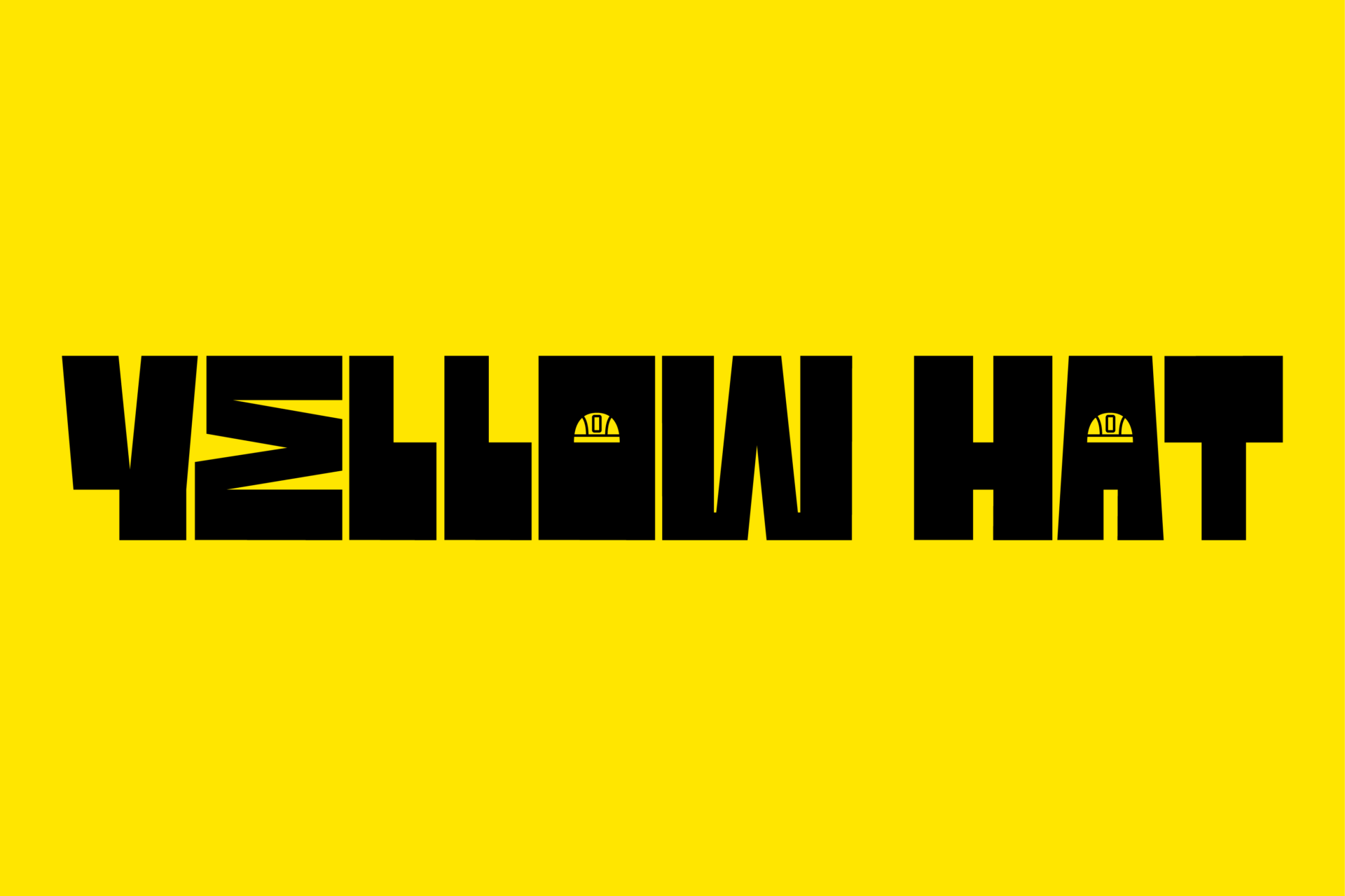
As I wanted to practice and utilize my lettering skills, I've decided not to typeset but instead; letter design. I wanted the wordmark to be dynamic and interesting while still being constructive and geometric. As the company is more about human relations, the safety helmets were added to make the logo more fun and dynamic. The overly exaggerated horizontal bar is also another intentional addition as it makes the construction of the logo stand out. As this is lettering design and not type design, I believe that this is acceptable. Overall, it is supposed to give the wordmark its "small scale" feeling.
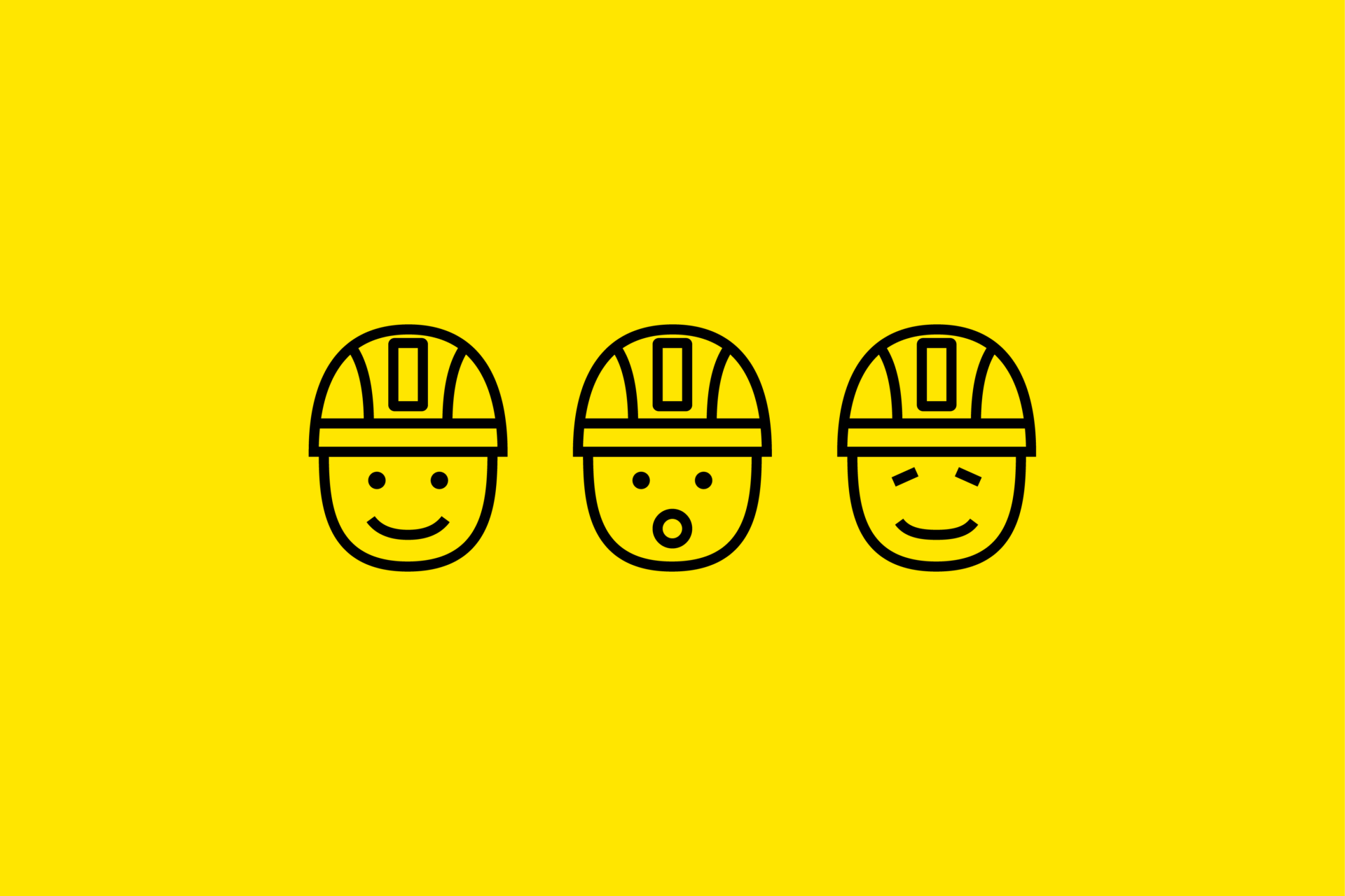
Mascot
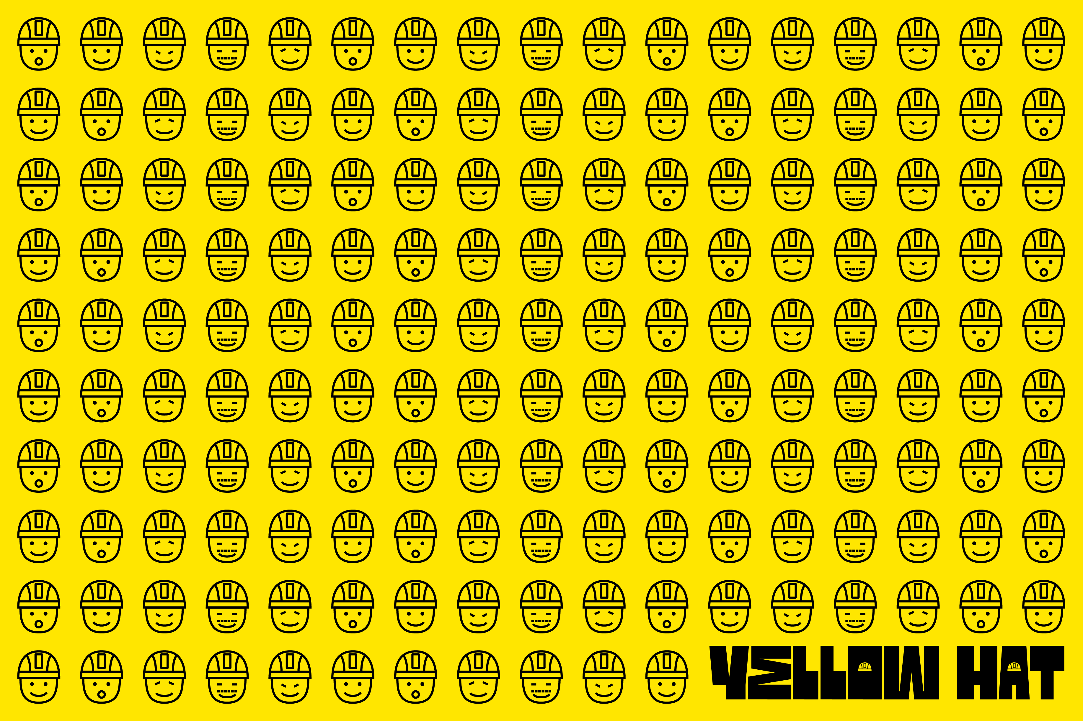
Alongside the identity, which is the wordmark, I also wanted a mascot for Yellow Hat to be known for. The simplistic yet emotional faces with a safety helmet makes the identity very fun and interesting. These faces stand for the people in the TA that Yellow Hat represents.
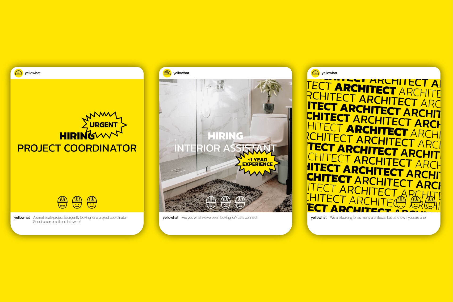
Social Media Posts
The social media posts are very simple but offer a wide range of styles depending on urgency and context. This approach is extremely minimalistic and utilizes primarily typography and hierarchy to catch doomscrollers off guard.
Website Look and Feel
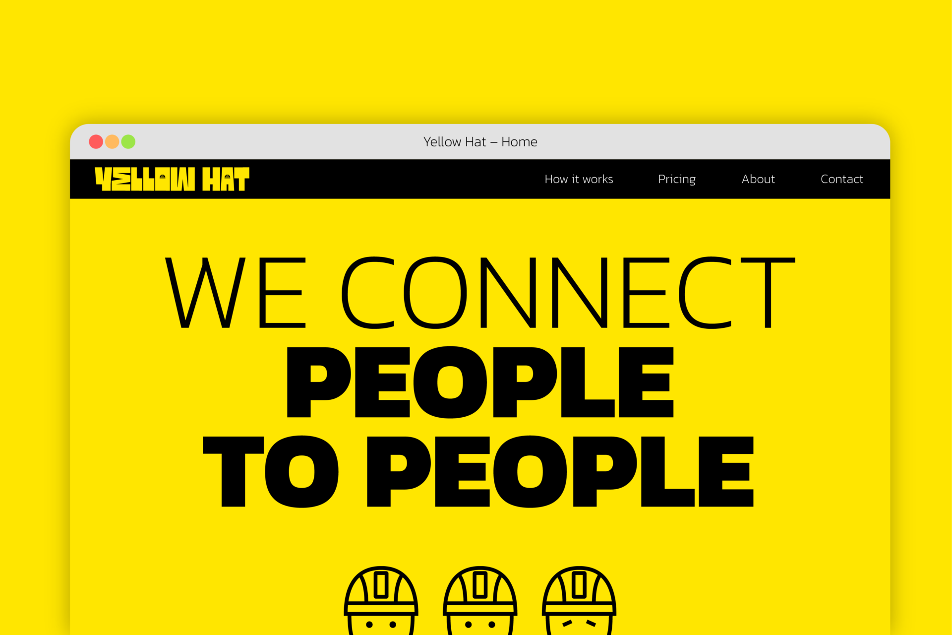
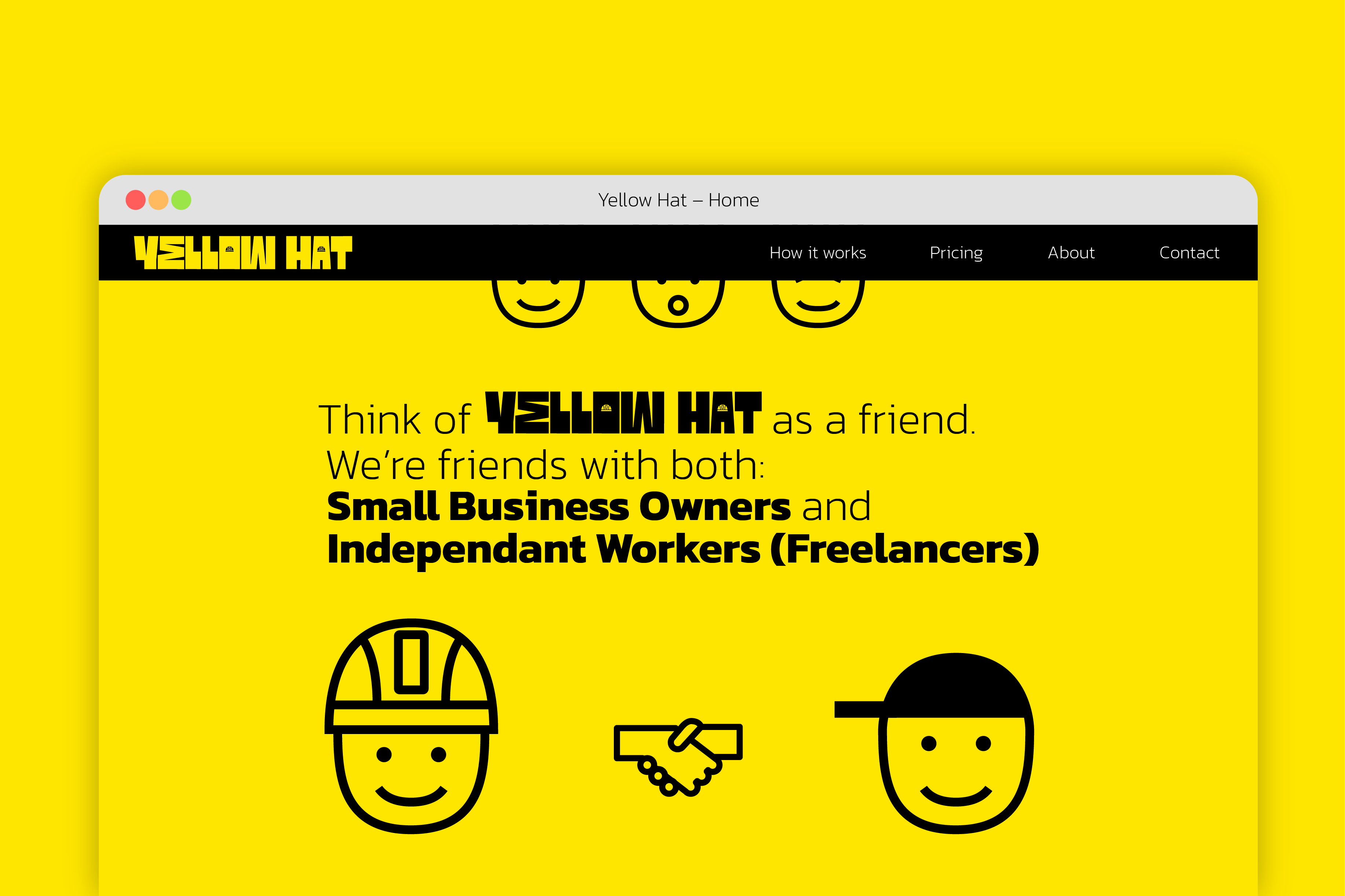
As this was a sprint, there wasn't enough time to finish pages of the website. So instead, I created a basic look and feel for the website.
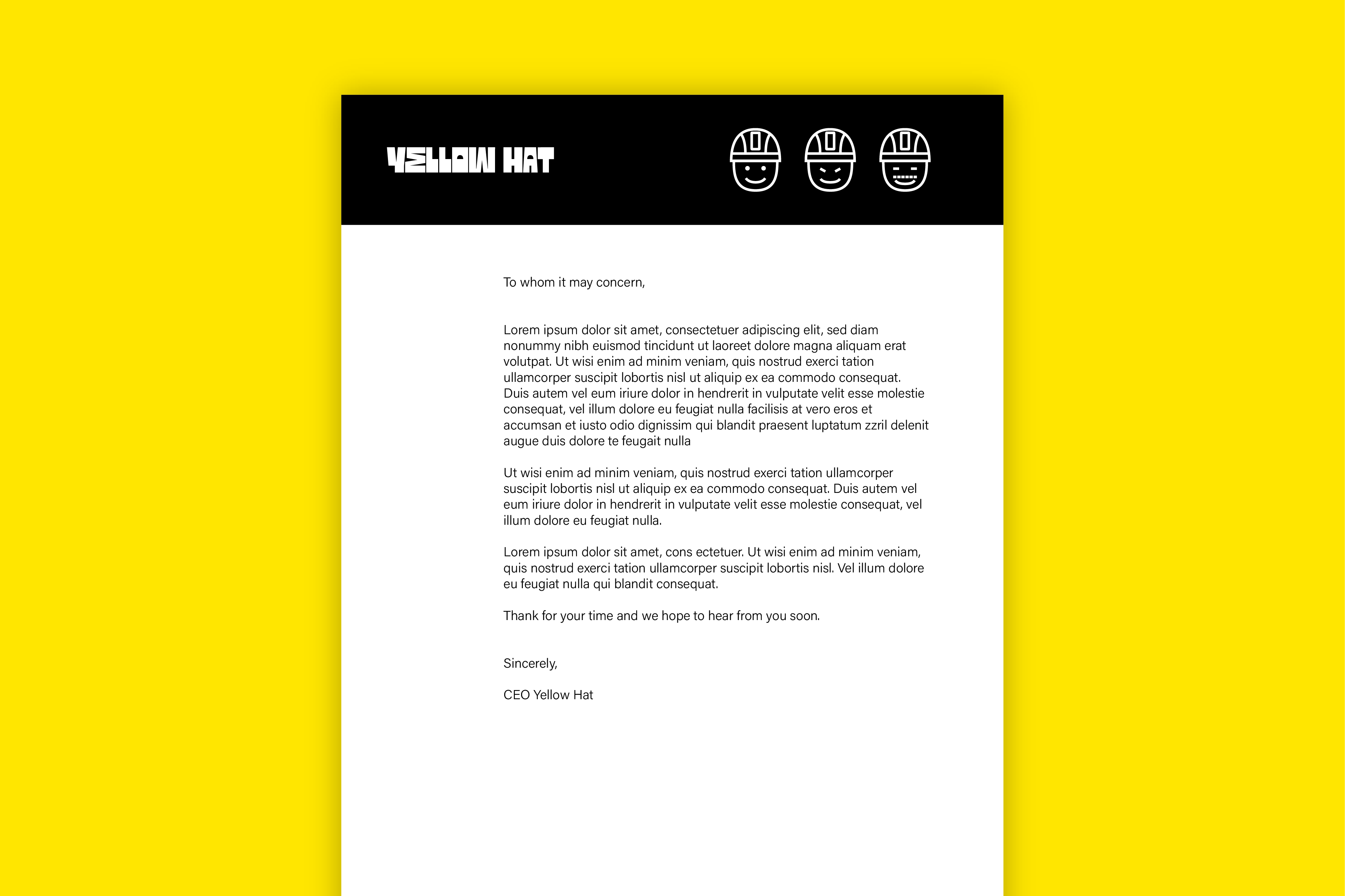
Letterhead
As a final addition to the project, I've decided to create a very simple letterhead template as the overall identity is already loud as it is
