The Brief
Duration: Two weeks
For a refinement project in our Art Direction class, we were told to take a campaign done previously in the quarter to refine. One of them was a campaign for Ripley's that could be worked on, which was the one I chose. The brief asks for three variations of the ad. The full process book which includes the type treatment, color palette as well as a graphic board, can be found here.
Idea and Lead-up
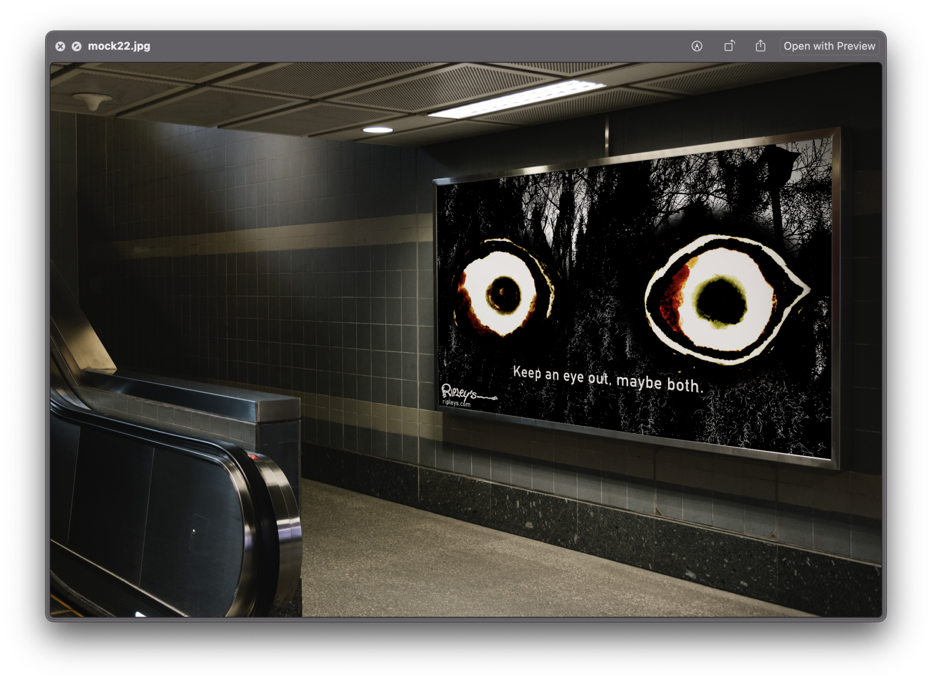
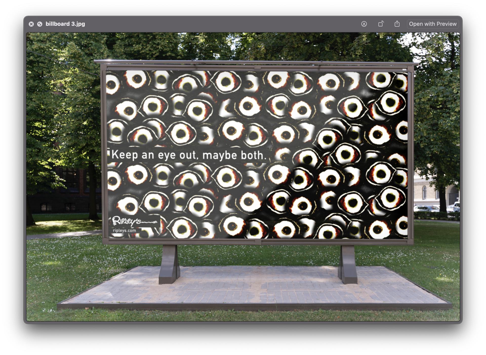
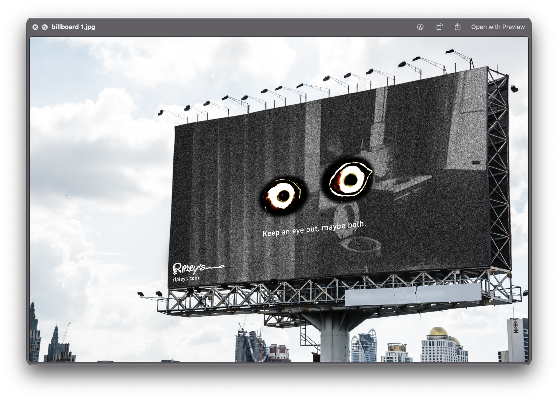
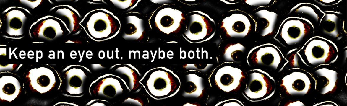
Ripley’s is doing something scary this Halloween. The activation includes both in-person attractions as well as online. To drive sales, a series of print ads will be created to increase traffic on social media as well as our website. The ad will have to be eye-catching and mysterious (won’t answer any questions beforehand.)
Strategy statement: Convince people interested in horror that they should visit our website because it would certainly peak their interest.
Direction
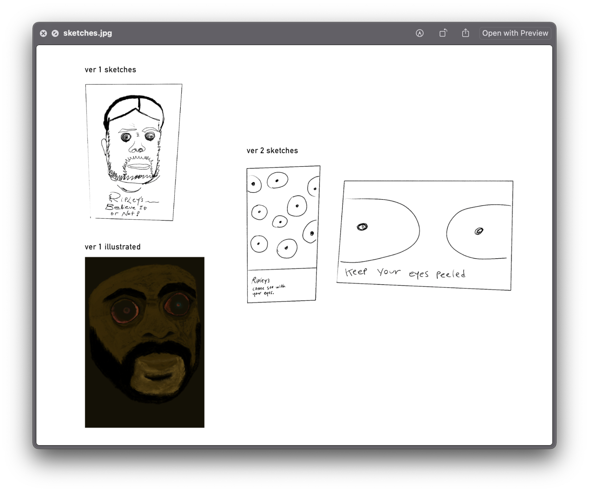
As Ripley's is a brand that deals with all things "freaky", a visual direction of something that falls into the line of horror wouldn't be suprising. Ripley's tagline is "Believe it or not!". What comes with believing is seeing; using your eyes. With that motif, I created the series with the visual of eyes, in mind.
The eye motif comes from Hugh Francis; a figure that was commonly associated with Ripley's (at least for me). What gave Hugh a spot at Ripley's was his eye-popping ability which I first saw when I was extremely young and probably gave me a few sleepless nights. The Hugh I saw was a wax sculpture and has a very special place in my heart.
Drafts and Sketches
Execution